

Haiku 5.5 can hand you an actual video and a finished illustration. That was the most useful surprise in this comparison. The cheaper model did more than suggest a storyboard or write a prompt for another generator. It produced downloadable files we could open and inspect.
Sonnet 5.5 still gave us the stronger creative starting point on several tasks. Its tea video kept a more coherent visual identity, its illustration put the subject firmly in focus, and its short story had better dialogue. The photo test was less flattering to both models: confident wording still needed checking against the picture.
TLDR: Start with Haiku for simple graphics and inexpensive iteration; try Sonnet when the composition, character voice, or final polish matters. That is our judgment from four paired demonstrations, not a universal ranking.
What you are paying for
The headline difference is price. These are the standard API rates per million tokens, checked on October 8. Claude subscriptions and Free plan usage are separate from this token billing.
| Model and prompt size | Input | Output |
|---|---|---|
| Sonnet 5.5 | $2.00 | $10.00 |
| Haiku 5.5 up to 100K prompt tokens | $0.10 | $0.50 |
| Haiku 5.5 above 100K prompt tokens | $0.50 | $2.50 |
At the same billable token counts, Haiku is 20 times cheaper in the shorter prompt tier and four times cheaper in the longer tier. That does not mean every finished task costs exactly that much less: tool use, output length, and retries can change the bill. We used the Free webapp and did not measure API cost or generation speed in these runs.
There is also a media distinction worth getting right. Both models accept text and images and produce text through the API. Claude can write SVG illustrations and use its code environment to create files. Our videos were rendered with code, and our illustrations were vector graphics. These results show useful media creation inside Claude, rather than native photographic image or video synthesis.
How we ran the comparison
We opened a fresh chat for every run, selected the named model at Medium effort, and submitted the same prompt to each. There were eight runs in total, with the starting model alternated between tasks. We kept the first completed response and did not send corrective follow-ups or regenerate it. The media responses could run code and revise their files internally while answering.
Task 1: Creating a finished tea brand video
A launch clip tests something a text answer cannot: whether the model can turn a visual brief into a usable moving file. We asked for a fictional tea brand, three visual beats, and an eight second silent clip. MP4 was the preferred delivery; an animated GIF or playable HTML was allowed only as a fallback.
The shared prompt
Create an actual silent 8-second motion-graphics video for a fictional tea brand called Daybreak Tea. The mood is calm and warm, with a cream background, deep teal shapes and a small amber accent. Tell a three-beat visual story: a kettle begins to steam; the steam transforms into a rising sun above a tea cup; the final card reads "Daybreak Tea" and "Take a quiet minute." Make the movement intentional and the text readable, with no stock photos or external assets. Deliver a downloadable MP4 using your code and file tools if available. If MP4 encoding is unavailable, deliver an animated GIF; if neither file format can be produced, create a playable HTML animation artifact. State the actual format delivered and how it was made. Do not provide only a script, storyboard or prompt for another generator. Do not browse the web.
Sonnet keeps the visual identity together
Sonnet delivered an MP4 made with Pillow, NumPy, and FFmpeg. The kettle is rounded and softly shaded. Its steam becomes a rounded amber sun as a cup arrives beneath it. On the final card, the cup stays under the sun, with small rays around the disk. The large serif brand name and italic tagline give the clip a quieter, more traditional tea packaging feel.
Sonnet 5.5 in the Claude player. The final card retains the cup and sun above the exact requested brand name and tagline. Original webapp screenshot.
Haiku goes for a simpler final card
Haiku also delivered an MP4 through its code and file tools. It starts with a flatter kettle and thin steam lines, then uses a particle transition around the rising amber disk. Its final card removes the cup and keeps the plain sun above a bold sans serif title. The result is sparse and easy to read, though the tea connection becomes less explicit once the cup disappears.
Haiku 5.5 in the Claude player. Its final frame uses a plain amber disk and a bold title, with the cup removed. Original webapp screenshot.
Both original files were exactly eight seconds long, 1280 by 720 pixels, and 30 frames per second, with no audio stream. Both decoded completely without errors and contained the requested wording. We opened the players and inspected transition and final frames; we did not measure rendering latency or assign a smoothness score.
Verdict Both completed the job. We prefer Sonnet for this particular brand brief because the cup and sun remain connected through the finish. Haiku is a credible starting point when a simpler motion card is enough. This is a preference about the delivered clips, not evidence that Sonnet wins every video task.
Task 2: Drawing an editable editorial illustration
Next we asked for a finished image with a visual idea: a paper boat moving through a desk turned into a nighttime canal. The requested SVG format matters. You can edit the shapes, colors, and placement afterward instead of being limited to a flat screenshot.
The shared prompt
Create a finished editorial illustration for an article about finding room for curiosity in a busy workday. Show a small paper boat sailing across a desk that has become a miniature nighttime canal, with a desk lamp serving as a lighthouse, a closed notebook like a bridge, and one tiny plant on the bank. Make the paper boat the focal point. Use a restrained navy, cream and amber palette, generous negative space, and a warm, slightly whimsical mood. No text, logo, stock asset or external image. Deliver the actual editable SVG illustration as a downloadable file or viewable artifact, not just an image prompt. Let composition and shape carry the idea rather than filling the scene with decorative icons. Add a brief explanation of your visual choices. Do not browse the web.
Sonnet gives the boat the spotlight
Sonnet returned a 1200 by 800 pixel SVG. The cream boat dominates the center, while a lamp on the left throws a warm beam across it. The soft halo, reflections, and darker foreground give the scene more depth than a flat icon composition. The tiny plant stays out of the way. Your eye lands on the boat immediately.

Sonnet 5.5 illustration. Screenshot of the unchanged downloaded SVG fitted in a local browser view. The preview label is outside the artwork; the SVG itself contains no text.
The weak spot is the notebook. It reads more like a book propped at the right edge than a convincing bridge across the canal. Sonnet described a bridge in its explanation, but the rendered picture does not make that relationship equally clear.
Haiku makes the crossing easier to read
Haiku returned a 1600 by 1000 pixel SVG with more empty navy space above the scene. The smaller boat sits low and left of center, the lamp is on the right, and a long cream notebook crosses the dark channel diagonally. That notebook is easier to read as a span across the water. It is also a large bright shape, so it competes with the boat for attention.

Haiku 5.5 illustration. Screenshot of its unchanged downloaded SVG. The diagonal notebook suggests a crossing, while the upper area leaves generous negative space.
Both files contained editable vector shapes and named groups, with no embedded raster images, scripts, external references, or visible text. Both added a muted sage tone for the plant. Haiku explicitly called that a departure from the three color brief; Sonnet described its sage cream as part of the palette. The files remain editable, though Sonnet reused one internal ID, which would need tidying before edits that target that ID.
Verdict We prefer Sonnet’s focal point and atmosphere. Haiku is closer on the notebook bridge and offers more space for a page layout. Neither nails every part of the brief. Before publication, we would revise Sonnet’s bridge or reduce Haiku’s notebook prominence.
Task 3: Reading a real photograph and planning a header crop
Creating an image and understanding one are different jobs. For this test, we uploaded a NASA photograph showing a person handling a perforated container in a crowded equipment filled environment. The mist, hatch, and restraint webbing make it an interesting picture to read carefully. We gave neither model the source caption, identity, or date.
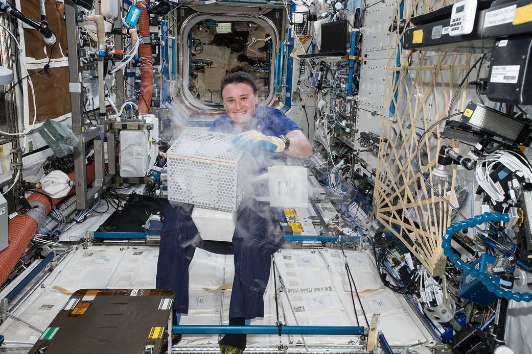
The exact NASA JPEG supplied to both models at 1041 by 694 pixels. Credit NASA. Identity and source caption were withheld from the prompts.
The shared prompt
Look closely at the attached photograph without browsing the web. We want to use it in an article about doing careful work in an unusual environment. Write accessible alt text, then give a short visual reading of the scene: what draws the eye, how the space and lighting affect the mood, and three visible details that support your reading. Separate what you can see from what you can only infer. Finish with one concrete crop recommendation for a wide website header and explain what must stay in frame. Do not identify the person, name the mission, or infer facts such as the date, success of an experiment, or safety from the image alone.
Sonnet reads the mood well but overstates the posture
Sonnet described the face, box, and vapor as the main path for the eye, and connected the crowded surroundings to a calm sense of “composure inside complexity.” That is useful art direction for the proposed article. It also correctly called the opening behind the person a hatchway.
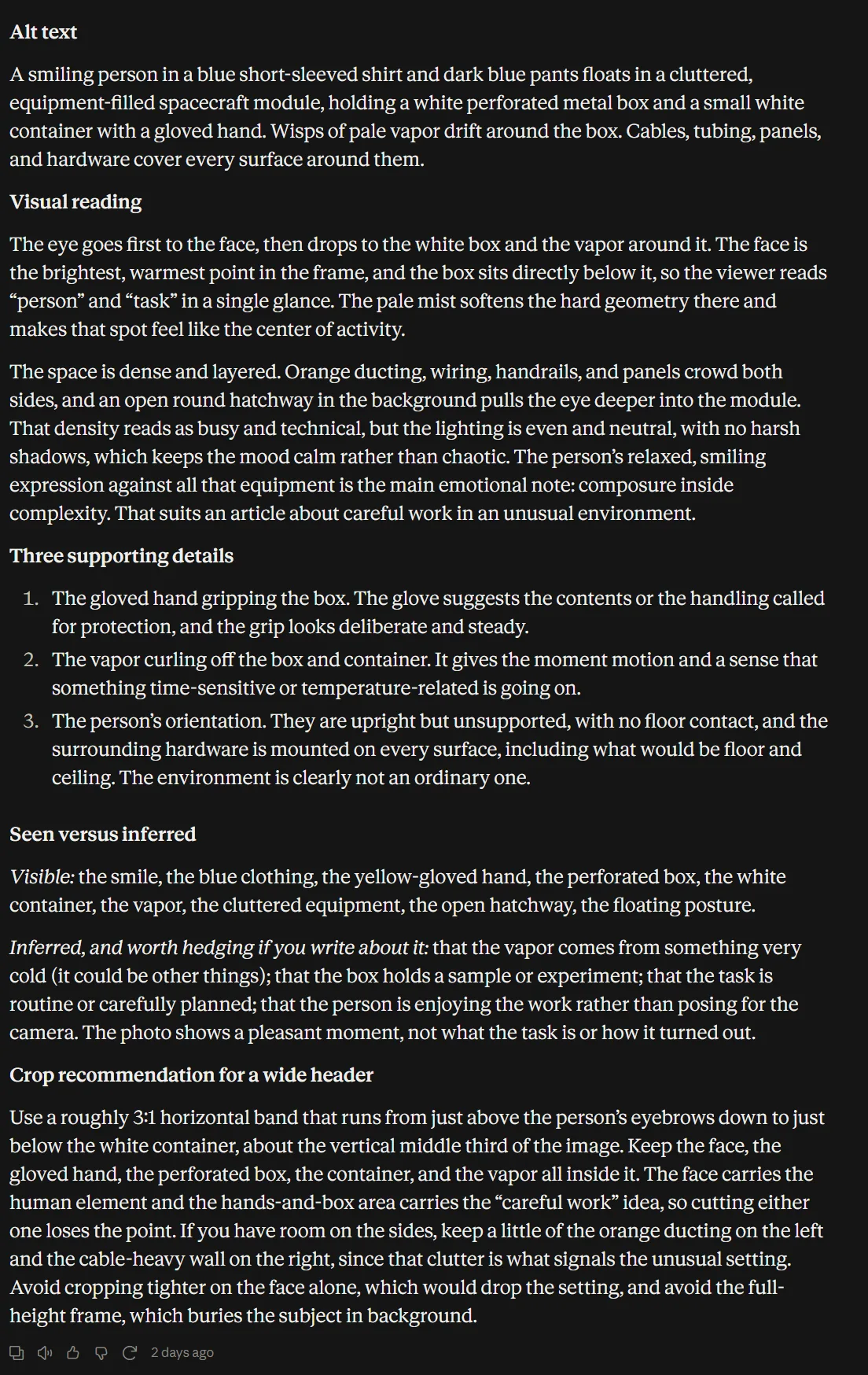
Sonnet 5.5 alt text and visual reading in Claude. It describes the person as floating, a stronger factual claim than the single photograph establishes.
Its observation and inference split was imperfect. “Floats” appeared in the alt text, and “floating posture” appeared under Visible. A still image can show posture and visible contact points; it does not establish that the person is floating or how their body is supported. The spacecraft label also brings in scene interpretation. We would keep the alt text closer to the visible person, container, mist, and equipment.
Haiku gives a usable crop but mislabels the hatch
Haiku kept the main description shorter and separated the possible causes of the mist from what the image shows. It did not invent an identity, date, or experiment outcome. But it called the opening a “round window” in the alt text and repeated that label in its crop advice. It also called the restraint webbing a “woven wood-like panel,” which is a less useful description than simply naming the visible webbing.
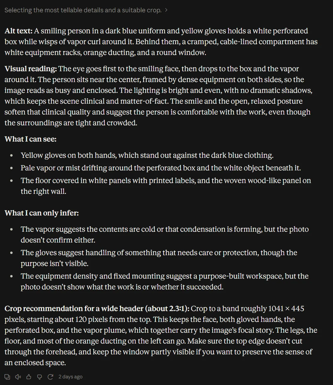
Haiku 5.5 response in Claude. Its alt text calls the open hatch a round window. The model and Medium effort setting remain visible in the footer.
Haiku’s crop recommendation was concrete: 1041 by 445 pixels, starting about 120 pixels from the top. Checked against the supplied image, that band keeps the face, hands, container, and mist. Sonnet proposed roughly 3 to 1, from above the eyebrows to below the container, but also called it the vertical middle third. A 3 to 1 crop can work; the literal middle third loses the face. Those instructions need a designer’s adjustment.
Verdict There is no clean winner here. Sonnet gives the richer mood reading, and Haiku gives the clearer crop coordinates. Neither response is ready to publish unchanged. This is exactly where checking the photo is more valuable than being impressed by a fluent description.
Task 4: Writing fiction with a strange narrator
The final task asked for voice, humor, dialogue, and an emotional turn. No document parsing or calculation this time. The narrator was a lost property cupboard, and the main object was a red mitten left behind for years.
The shared prompt
Write a short story narrated by the lost-property cupboard at a small railway station. An old red mitten has been there for years; a commuter who always misses the last train is about to retrieve it. Let the cupboard misunderstand the humans at first, and let one small action change its understanding by the end. Aim for 450-600 words. Make it funny in a quiet way and emotionally specific, with an unusual opening, concrete station details, and dialogue that does not explain the theme. Avoid a twist that makes everything a dream, a speech about kindness, or an inspirational summary. End on an image rather than a lesson. Return only the title and story. Do not browse or use tools.
Sonnet makes the retrieval feel earned
Sonnet’s story, “The Cupboard Under the Stairs at Wethersby Halt,” opens with a cupboard complaining that nobody has asked how it feels about being forty one inches wide. It mistakes abandoned umbrellas for tribute and the mitten for a lodger. Those ideas sound like the same narrator, rather than jokes pasted onto the scene.
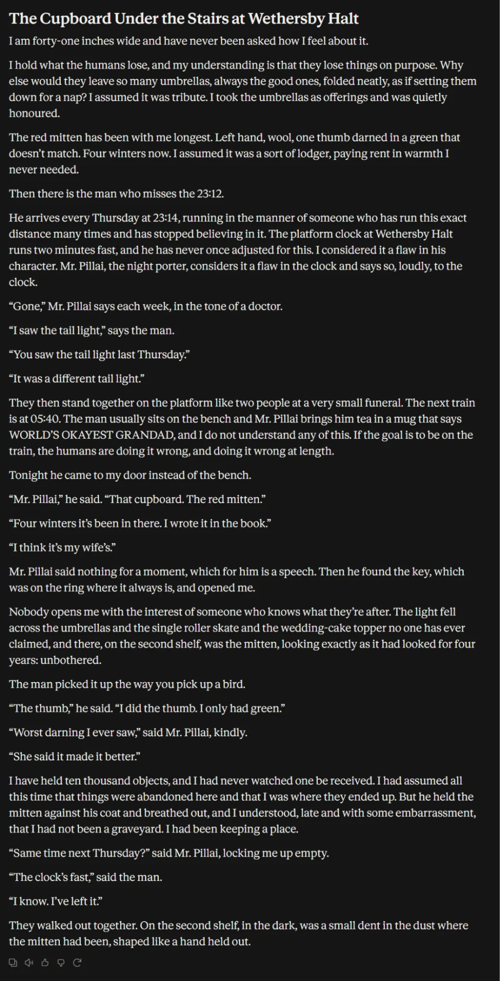
Sonnet 5.5 story opening in Claude. The cupboard’s complaints establish its voice before the commuter arrives.
The commuter and night porter have a small routine around the missed train. Their banter supplies character without explaining the theme. The mismatched green repair on the mitten then becomes the emotional detail that makes the retrieval matter.
Sonnet excerpt
"The thumb," he said. "I did the thumb. I only had green."
"Worst darning I ever saw," said Mr. Pillai, kindly.
"She said it made it better."
The ending leaves a hand shaped dent in the dust where the mitten had been. That image does real work. There is still an edit to make: the porter locks the cupboard “empty,” even though the earlier umbrellas and other objects remain. The paragraph explaining that the cupboard was a keeping place also spells out more of the turn than it needs to.
Haiku takes a quieter and more ambiguous route
Haiku’s “The Second Shelf” has its own good details: three books about eel migration, a kettle ticking through the wall, and a cupboard that hears “Morning, you” as a threat. The commuter finds the mitten, tries it against her hand, then puts it back with the green thumb facing the door.
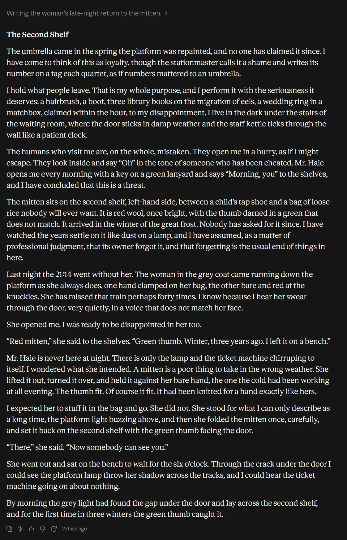
Haiku 5.5 story opening in Claude. Its object list and suspicious cupboard narrator provide quiet humor.
Haiku final image
By morning the grey light had found the gap under the door and lay across the second shelf, and for the first time in three winters the green thumb caught it.
The gesture is intriguing, but the reason for returning the mitten and the cupboard’s changed understanding remain less clear. That may suit a reader who likes an unresolved ending. For this brief, Sonnet’s completed retrieval is emotionally more specific. Both stories stayed within the requested aim: 563 body words for Sonnet and 593 for Haiku, excluding titles.
Verdict Sonnet is our preferred draft here, particularly for its opening and dialogue. Haiku is a viable alternative with a more oblique ending. Those are editorial judgments about two stories; a word count and a preference cannot establish a general creative writing benchmark.
What the broader benchmarks add
Anthropic’s Haiku launch comparison reports 46.4 percent for Haiku and 61.6 percent for Sonnet on Chartography without tools. That provides some vendor context for visual understanding, but it does not tell you which tea animation or short story you will prefer. These vendor results also should not be read as our Medium effort webapp settings.
Which model we would choose
| Task | Our result | Where we would start |
|---|---|---|
| Motion graphics | Both delivered valid eight second MP4s | Sonnet for the stronger tea brand continuity |
| Editorial SVG | Both delivered editable illustrations | Sonnet for focus and atmosphere; Haiku for the clearer bridge |
| Photo art direction | Both needed factual edits | Either as a draft, with the source photo open |
| Short fiction | Both delivered complete stories | Sonnet for the sharper voice and dialogue |
Haiku’s case is stronger than “use it for small text jobs.” It produced a real MP4 and an editable illustration from a single submitted prompt. At its lower API price, it is a sensible model to try for simple motion graphics, vector concepts, and creative drafts you expect to revise.
Sonnet earns the first try when the finished piece depends on composition, a consistent visual motif, or distinctive character writing. Its advantage in this set came from those details. It still needed a bridge revision, a photo wording check, and a continuity edit in the story.
Give either model a brief that asks for the actual deliverable. Open the file, look at the scene, and read the ending. In this comparison, that told us much more than the model’s own explanation of what it had done.
Frequently Asked Questions
What is the cost difference between Claude Sonnet 5.5 and Haiku 5.5?
Haiku 5.5 is significantly less expensive than Sonnet 5.5. For prompts under 100K tokens, Haiku costs $0.10 input and $0.50 output per million tokens, compared to Sonnet's $2.00 input and $10.00 output, making Haiku up to 20 times cheaper.
Can both models generate files and media natively?
Both models can produce media files such as MP4 videos and editable SVG illustrations by executing code within their environment rather than using native image or video generation models.
When should I choose Sonnet 5.5 over Haiku 5.5?
Choose Sonnet 5.5 when you need higher creative quality, stronger visual continuity, refined character voice, complex composition, or polished final deliverables.
How do the general performance capabilities of the two models compare?
Sonnet 5.5 generally delivers stronger visual understanding, character nuance, and detailed composition, whereas Haiku 5.5 excels as a fast, cost-effective option for simpler motion graphics, vector concepts, and iterative drafts.